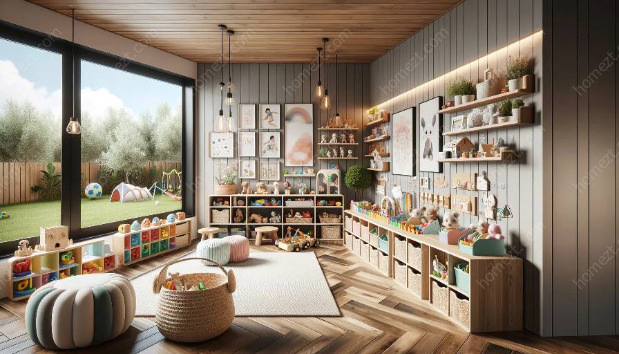
A split-complementary color scheme is a dynamic and engaging color combination that can bring energy and vibrancy to any space. Understanding this color scheme and how it relates to nursery and playroom design can help create welcoming and stimulating environments for children.
What is a Split-Complementary Color Scheme?
A split-complementary color scheme is a variation of the complementary color scheme, which uses two colors that are opposite each other on the color wheel. In a split-complementary scheme, instead of using just one complementary color, you use the two colors adjacent to its complement. This creates a balanced yet visually interesting color palette that can be used to create focal points and balance in a room.
Using the Split-Complementary Color Scheme in Nursery and Playroom Design
When it comes to designing nurseries and playrooms, the split-complementary color scheme can be a fantastic choice. The use of bold and vibrant colors can stimulate a child's imagination and create an environment that is both fun and visually appealing, while still maintaining a sense of balance and harmony.
For example, a split-complementary color scheme could include a base color like soft blue, with accents of orange and yellow. These colors work well together to create a cheerful and lively atmosphere, perfect for a playroom or nursery. By using the split-complementary color scheme, you can create a space that is visually engaging without being overwhelming.
The Importance of Color Schemes in Design
Color schemes play a crucial role in interior design, especially when it comes to creating spaces for children. The right color scheme can stimulate creativity, encourage learning, and support emotional development. By understanding and implementing the split-complementary color scheme, you can design spaces that are not only visually appealing but also contribute to a child's overall well-being and development.
Incorporating the Split-Complementary Color Scheme
When incorporating the split-complementary color scheme into nursery and playroom design, it's essential to consider the overall layout and furniture of the room. Using the base color as the dominant color for walls and larger furniture pieces, and using the complementary colors for accents such as artwork, rugs, and accessories, can create a cohesive and balanced space. This approach allows for a playful and dynamic color scheme, while still maintaining a sense of harmony and balance.
Conclusion
The split-complementary color scheme offers a vibrant and engaging color palette that can be effectively used in nursery and playroom design. Understanding the importance of color schemes and their impact on children's well-being is key to creating welcoming and stimulating environments. By implementing the split-complementary color scheme, you can design spaces that are visually appealing, supportive of growth and creativity, and create a positive impact on children's lives.


