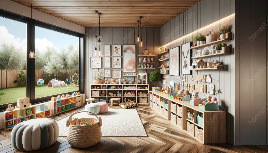
Understanding secondary colors and their role in creating vibrant and stimulating nursery and playroom designs is essential for parents and interior designers alike. In this comprehensive guide, we will delve into the concept of secondary colors, their psychology, and how they can be effectively used in color schemes for children's spaces. We will explore various color combinations and provide practical tips for incorporating secondary colors to create visually appealing and stimulating environments for children.
What Are Secondary Colors?
Secondary colors are the result of mixing two primary colors in equal parts. The three primary colors - red, blue, and yellow - are combined to produce three secondary colors: green, orange, and purple. Secondary colors are located between the primary colors on the color wheel, forming the basis of color theory and design.
The Psychology of Secondary Colors
Understanding the psychological impact of colors is crucial when designing spaces for children. Secondary colors evoke a sense of vibrancy, energy, and playfulness, making them ideal for nursery and playroom environments. Green, associated with nature and growth, can create a calming and refreshing atmosphere. Orange is often linked to creativity and enthusiasm, while purple suggests luxury and mystery. By leveraging the psychology of colors, parents and designers can create spaces that foster children's emotional and cognitive development.
Applying Secondary Colors in Color Schemes
Creating harmonious color schemes that incorporate secondary colors is key to designing visually appealing nursery and playroom environments. Employing the principles of color theory, such as complementary, analogous, or triadic color schemes, can help achieve balance and cohesiveness. For instance, pairing complementary colors like purple and yellow can create a vibrant and dynamic look, whereas an analogous scheme using shades of green and blue may induce a sense of tranquility and balance.
Color Schemes for Nursery and Playroom Designs
When designing nurseries and playrooms, it's important to consider the age of the children and the desired atmosphere. For infants and young children, soft pastel shades like mint green and pale orange can create a soothing and nurturing environment. As children grow older, bolder color choices such as bright primary colors or rich secondary hues may encourage creativity and cognitive stimulation. Integrating versatile color palettes that can adapt to evolving preferences and needs ensures longevity in design.
Practical Tips for Implementation
- Consider the natural light in the space when choosing and applying secondary colors, as it can influence the perceived intensity of the hues.
- Use secondary colors as accents through furniture, wall decor, and accessories to infuse playful pops of color without overwhelming the space.
- Blend secondary colors with neutral tones to create a balanced and versatile backdrop for the room, allowing flexibility for future updates or changes.
- Engage children in the design process by allowing them to select their favorite secondary colors, fostering a sense of ownership and creativity.
- Utilize color psychology to create designated zones within the space, such as calming areas in green hues and energizing zones in orange or purple.
Conclusion
Secondary colors offer a wealth of opportunities for creating engaging and visually stimulating nursery and playroom designs. By understanding the principles of color theory and the psychology of colors, parents and designers can craft vibrant and nurturing spaces that support children's holistic development. Whether it's using complementary color schemes to foster dynamism or leveraging the calming qualities of certain hues, the strategic use of secondary colors can instill a sense of wonder and creativity in children's environments, setting the stage for memorable and inspiring experiences.


