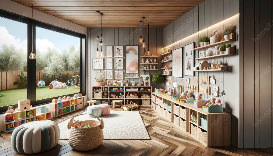
Traditional color schemes hold a timeless appeal and can bring warmth and comfort to nurseries and playrooms. The use of classic color combinations can create a welcoming and visually stimulating environment for children. In this comprehensive guide, we will explore the significance of traditional color schemes, their compatibility with modern color palettes, and their application in creating harmonious nursery and playroom designs.
Understanding Traditional Color Schemes
Traditional color schemes often draw inspiration from historical periods and cultural influences, embodying a sense of familiarity and timelessness. These color combinations have stood the test of time and continue to evoke a sense of nostalgia and charm. Classic hues such as soft pastels, earthy tones, and deep jewel-like colors form the foundation of traditional color palettes.
The Impact of Traditional Color Schemes
When applied to nursery and playroom design, traditional color schemes can have a profound impact on the overall ambiance of the space. Soft pastel shades, such as light blues, pinks, and yellows, create a soothing and serene atmosphere, ideal for nurseries. These colors are known for their calming effects and can contribute to a peaceful environment for both children and parents.
Earth tones, including warm browns, greens, and neutrals, can infuse a sense of coziness and natural simplicity into playrooms. These colors evoke a connection to the outdoors and can inspire creativity and imaginative play. Additionally, deep jewel tones like rich blues, greens, and purples add a touch of elegance and sophistication to the space, creating an enchanting and inviting ambiance.
Compatibility with Modern Color Schemes
While traditional color schemes exude a timeless charm, they can be seamlessly integrated with modern color palettes to achieve a harmonious balance. Incorporating pops of vibrant and contemporary hues within a traditional color scheme can inject a playful and dynamic energy into the nursery or playroom.
For instance, pairing classic pastels with bright accents such as citrus orange or aqua blue can add a modern twist to the overall design. Similarly, combining earthy tones with trendy shades like millennial pink or slate gray can create an eclectic and stylish aesthetic within the space.
Application in Nursery and Playroom Design
When designing a nursery or playroom with traditional color schemes, it is essential to consider the psychological and emotional impact of the chosen colors. Soft and soothing tones can promote relaxation and tranquility, while richer and deeper hues can stimulate creativity and imagination.
Furthermore, the strategic use of color can define specific areas within the space. For example, using a soft, pastel color for the nursery sleeping area can create a peaceful and calming environment, while incorporating vibrant and energetic colors into the playroom section can encourage active and imaginative play.
Additionally, incorporating textures and patterns within the color scheme can enhance the visual appeal of the space. The use of textiles, wallpaper, and decorative accents in coordinating colors can add depth and dimension, creating a visually engaging environment for children.
Conclusion
Traditional color schemes offer a timeless and enduring appeal that is well-suited for nursery and playroom design. By understanding the significance of classic color combinations, their compatibility with modern palettes, and their application in creating inviting spaces for children, parents and designers can create visually captivating and emotionally enriching environments that stand the test of time.

