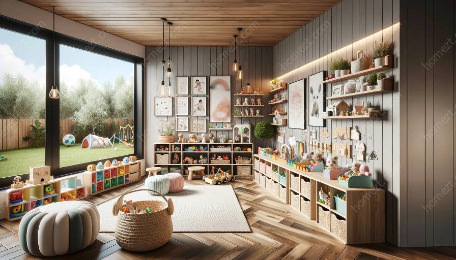
When it comes to creating vibrant and engaging spaces for children, primary colors play a crucial role. Whether you're designing a nursery or a playroom, understanding the fundamentals of primary colors and their compatibility with color schemes can help you create an attractive and stimulating environment for kids.
Understanding Primary Colors
Primary colors, namely red, blue, and yellow, form the basis of all other colors. They are pure and cannot be created by mixing other colors together. Understanding how these primary colors interact and blend is essential in creating captivating color schemes for nurseries and playrooms.
Red: The Color of Energy and Excitement
Red is a powerful and attention-grabbing color. It is often associated with energy, passion, and excitement. In a nursery or playroom, red can be used to create a stimulating and invigorating atmosphere. However, it's important to use red in moderation to avoid overwhelming the space and the children.
Blue: Tranquility and Calmness
Blue is known for its calming and soothing effects. It can evoke a sense of tranquility and relaxation, making it an ideal choice for creating a peaceful environment in nurseries and playrooms. Lighter shades of blue can create a sense of spaciousness, while darker blues can add depth and sophistication to the space.
Yellow: Sunshine and Cheerfulness
Yellow is often associated with happiness, sunshine, and warmth. It can bring a sense of playfulness and cheerfulness to nurseries and playrooms. However, using too much bright yellow can be overwhelming, so consider using softer shades or incorporating yellow as an accent color to balance the overall ambiance.
Creating Harmonious Color Schemes
When it comes to incorporating primary colors into nurseries and playrooms, it's essential to create harmonious color schemes that are visually appealing and stimulating for children. One popular approach is the use of complementary colors, which are located opposite each other on the color wheel. For example, pairing red with green or blue with orange can create lively and balanced color schemes.
Color Psychology in Design
Understanding color psychology can also be beneficial when designing nurseries and playrooms. For instance, incorporating different shades of blue can promote a sense of calmness and concentration, while touches of red can encourage energy and creativity. By utilizing the psychological effects of colors, you can tailor the environment to support children's development and well-being.
Implementing Colorful Elements
In addition to using primary colors in paint and wall coverings, consider incorporating colorful elements through furniture, decor, and play equipment. This can include vibrant rugs, playful wall decals, and colorful storage solutions. By introducing pops of primary colors in various aspects of the space, you can create an engaging and dynamic environment that sparks children's imagination and creativity.
Nurturing Creativity and Exploration
Nurseries and playrooms serve as spaces for children to explore, learn, and develop. By infusing primary colors into the design, you can stimulate their senses and inspire creativity. Consider providing art supplies in a variety of primary colors, setting up interactive play areas with colorful elements, and incorporating educational materials that celebrate the vibrancy of red, blue, and yellow.
Conclusion
Primary colors are a fundamental component of creating lively and captivating spaces for nurseries and playrooms. By understanding the unique characteristics of red, blue, and yellow, and how they interact within color schemes, you can design environments that are not only visually appealing but also supportive of children's growth and development. Embracing the vibrancy of primary colors allows you to craft spaces where imagination thrives, and the joy of childhood is celebrated.

