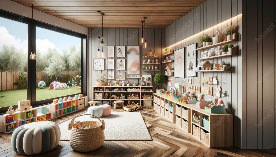
Colors play a crucial role in creating inviting and stimulating environments for children. In the realm of color theory, the complementary color scheme stands out as an attractive and effective approach for enhancing the aesthetics of nursery and playroom spaces. In this comprehensive guide, we will delve into the intricacies of the complementary color scheme, understand its compatibility with other color schemes, and explore its application in designing vibrant and visually appealing nursery and playroom settings.
Understanding the Complementary Color Scheme
The complementary color scheme revolves around the use of colors that are located directly opposite each other on the color wheel. These pairs of colors create a high contrast and vibrant visual impact when used together. The primary colors in the complementary color scheme include red and green, blue and orange, and yellow and purple. When combined, these colors intensify each other, making them well-suited for creating focal points and visual interest in a space.
Application of Complementary Colors in Nursery and Playroom Design
When it comes to designing nursery and playroom spaces, the complementary color scheme offers numerous opportunities to create compelling and lively atmospheres. By strategically incorporating complementary colors, designers can stimulate the visual senses of children and foster an environment that encourages creativity and play. For instance, using a mix of blue and orange can infuse energy and vitality into the playroom, while red and green can establish a dynamic and visually engaging nursery setting.
Compatibility with Other Color Schemes
While the complementary color scheme is powerful on its own, its compatibility with other color schemes opens up endless possibilities for creating harmonious yet captivating spaces. By integrating complementary colors with analogous or monochromatic color palettes, designers can achieve a balanced and cohesive look while still leveraging the striking contrast of complementary colors to enliven the environment.
Creating Balanced Interiors with Complementary Colors
When implementing the complementary color scheme in a nursery or playroom, it's essential to maintain balance and harmony to ensure a visually pleasing result. Designers can achieve this by utilizing one dominant color from the complementary pair and accentuating it with smaller doses of its complementary color. This approach prevents overwhelming the space while still harnessing the energy and dynamism offered by complementary colors.
Practical Tips for Incorporating Complementary Colors
- Color Blocking: Utilize color blocking techniques to divide the space using complementary colors, creating visual interest and a dynamic atmosphere.
- Accessorize Smartly: Use accessories and decor items in complementary colors to introduce pops of vibrancy and balance to the overall design.
- Neutral Foundations: Anchor the space with neutral elements such as walls and furniture, allowing complementary colors to stand out and make a statement.
Final Thoughts
The complementary color scheme offers a powerful tool for designing captivating and lively nursery and playroom environments. By understanding its principles, exploring its compatibility with other color schemes, and implementing practical tips, designers can elevate these spaces into visually engaging, stimulating, and delightful realms for children to thrive in.

