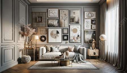
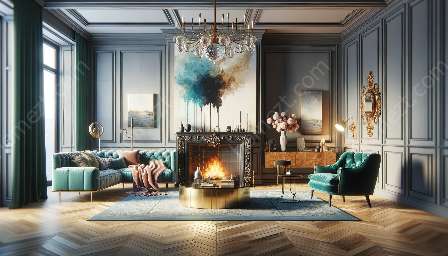
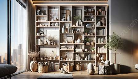
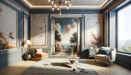
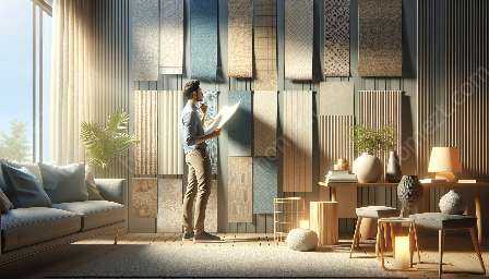
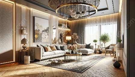
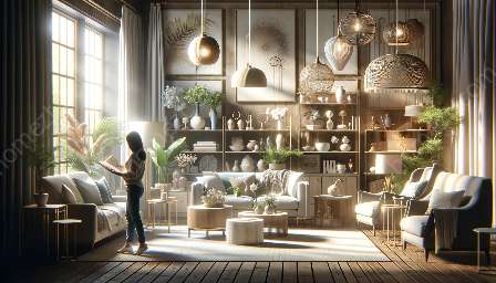
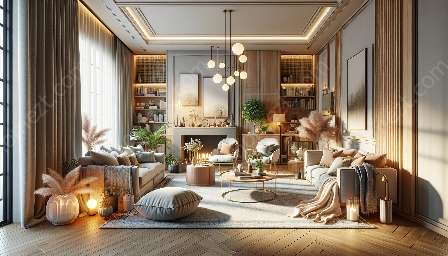
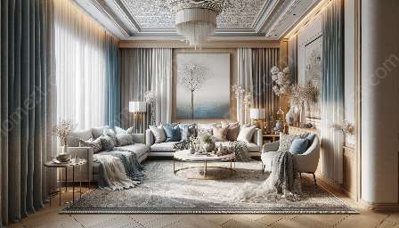
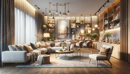
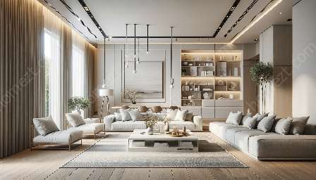
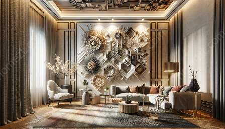
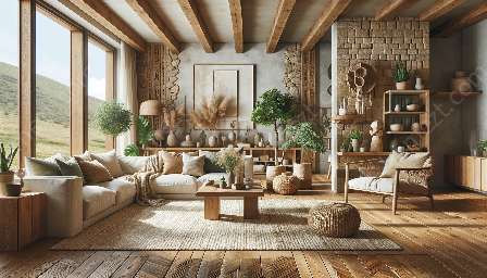
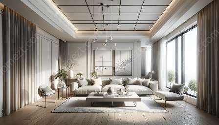
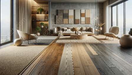
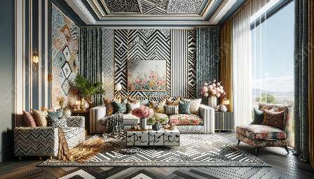
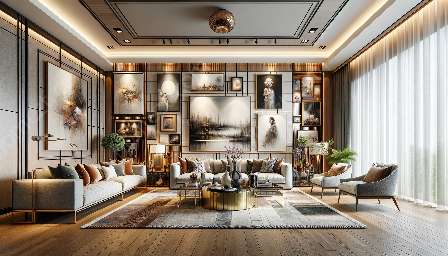
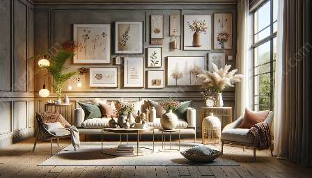
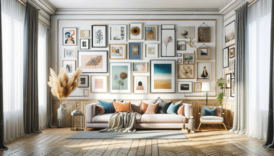
A well-designed gallery wall can be a focal point of any room, showcasing a collection of art, photographs, and other decorative elements. Visual hierarchy plays a crucial role in ensuring that such a display is visually appealing and well-balanced. This topic cluster will explore the principles of visual hierarchy and how they can be applied to gallery wall design. Moreover, we will discuss the importance of arranging gallery walls and decorating to create an aesthetically pleasing space.
Understanding Visual Hierarchy
The concept of visual hierarchy is based on the idea that certain elements within a design should be emphasized over others. This allows viewers to naturally navigate the visual content and understand its significance. In the context of a gallery wall, visual hierarchy helps guide the viewer's attention to specific pieces and creates a harmonious composition.
Key Principles of Visual Hierarchy
Several key principles contribute to the establishment of visual hierarchy in gallery wall design:
- Scale and Proportion: Varying the size and scale of artworks within the gallery wall can create a sense of hierarchy, with larger pieces drawing more attention.
- Contrast: The use of contrast in color, texture, and style can help certain pieces stand out and guide the viewer's focus.
- Alignment and Placement: Strategic alignment and placement of artworks can establish a visual flow and direct the viewer's gaze.
- Focal Point: Designating a focal point within the gallery wall can anchor the display and create a visual center.
Arranging Gallery Walls
Arranging a gallery wall involves thoughtful curation and placement to achieve a cohesive and visually appealing display. When arranging a gallery wall, consider the following factors:
- Theme or Concept: Consider a cohesive theme or concept, such as a color scheme or subject matter, to tie the artworks together.
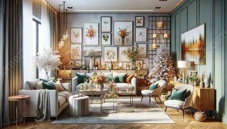
- Layout Planning: Experiment with different layout options, such as grid, salon-style, or asymmetrical arrangements, to find the most visually pleasing composition.
- Spacing and Balance: Maintain adequate spacing between artworks to allow each piece to stand out while ensuring overall balance in the arrangement.
- Consider the Environment: Take into account the surrounding space and furniture to ensure that the gallery wall integrates seamlessly with the room's aesthetics.
Decorating with Gallery Walls
Gallery walls are not only about the artworks themselves but also about how they complement and enhance the overall decor of a space. When decorating with gallery walls, consider the following tips:
- Integration with Surrounding Decor: Ensure that the gallery wall complements the existing decor, whether through color coordination or stylistic harmony.
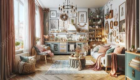
- Layering and Dimension: Use a variety of frame styles, sizes, and depths to create depth and visual interest within the gallery wall.
- Lighting and Accenting: Consider the use of accent lighting or natural light to highlight specific pieces within the gallery wall.
- Personalization: Incorporate personal touches, such as family photographs or personalized art, to add a sense of authenticity and warmth to the space.
Conclusion
Visual hierarchy is a fundamental principle in gallery wall design, guiding the eye and creating an aesthetically pleasing composition. By understanding the principles of visual hierarchy, effectively arranging gallery walls, and decorating with intention, one can elevate the visual impact of any space. Whether in a home, office, or public setting, a well-designed gallery wall can serve as a reflection of personal style and a conversation piece that enhances the overall atmosphere.

