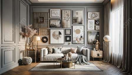
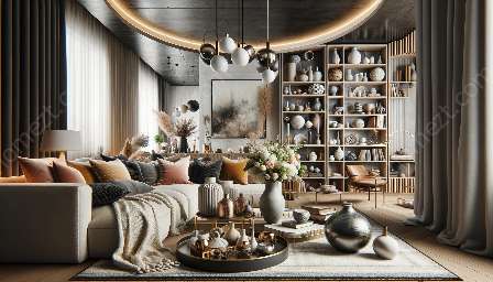
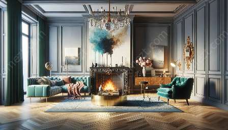
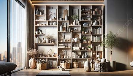
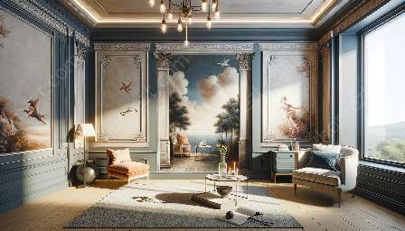
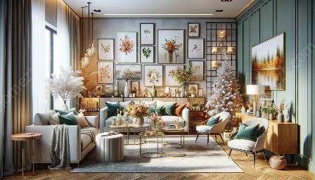
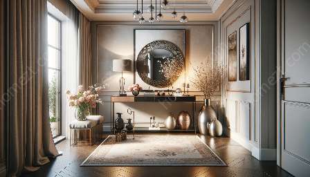
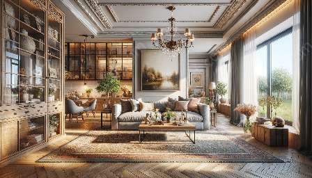
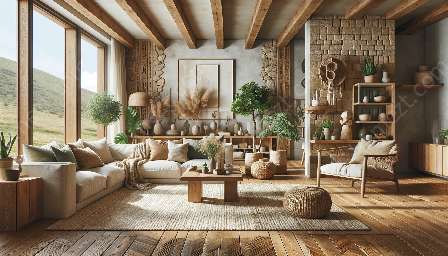
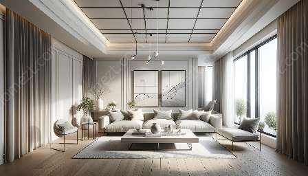
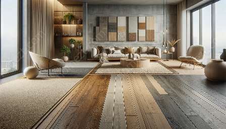
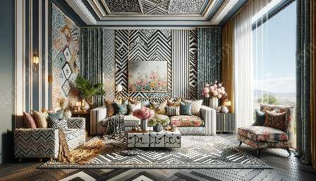
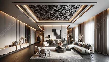
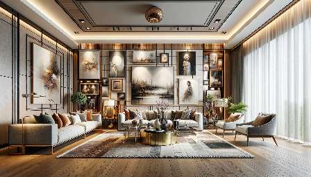
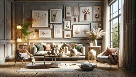
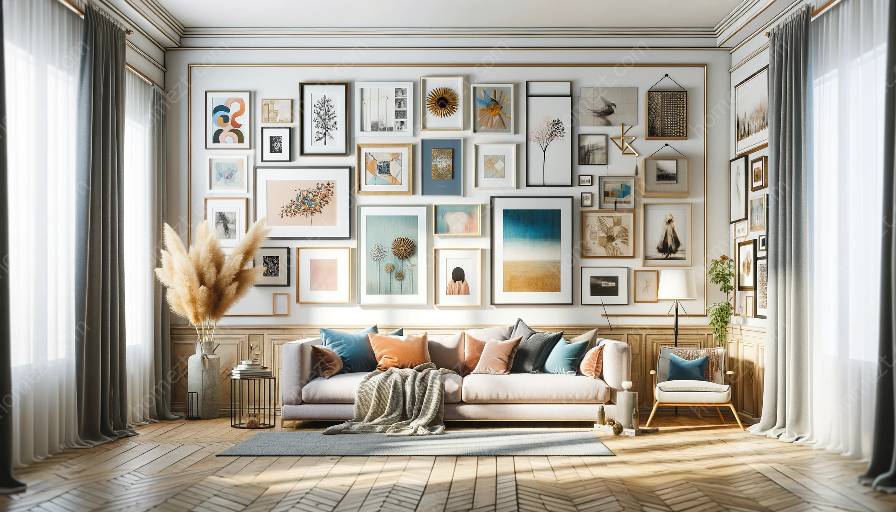
Creating an attractive gallery wall involves balancing colors and shapes to achieve a harmonious and visually pleasing display. By arranging gallery walls with careful consideration of color schemes and shapes, you can elevate your decor to new heights. This topic cluster delves into the art of balancing colors and shapes in a gallery wall, providing valuable insights into arranging gallery walls and incorporating appealing visual content.
Understanding the Role of Colors and Shapes
Colors and shapes play pivotal roles in the visual appeal of a gallery wall. Understanding the impact of these elements is essential for achieving a balanced and captivating display.
The Importance of Colors
Colors can evoke emotions, set moods, and create visual interest. When balancing colors in a gallery wall, consider the following:
- Color Harmony: Choose a cohesive color scheme that complements the overall decor of the room. Whether you opt for complementary, analogous, or monochromatic colors, ensuring harmony is crucial.
- Contrast: Incorporate contrasting colors to add depth and visual intrigue. Bold contrasts can create focal points and draw attention to specific elements within the gallery wall.
- Balancing Neutrals: Neutral colors act as anchors, providing a sense of balance and allowing bolder hues to shine without overwhelming the space.
The Influence of Shapes
Shapes can add rhythm, movement, and structure to a gallery wall. Consider the following aspects of shapes when arranging your display:
- Variety: Introduce a mix of shapes, such as rectangles, squares, circles, and organic forms, to create visual diversity and prevent monotony.
- Composition: Pay attention to the arrangement of shapes to create a balanced composition. Achieve equilibrium by distributing different shapes evenly throughout the display.
- Scale: Vary the scale of shapes to add depth and dimension. Incorporating large and small shapes can create a dynamic visual experience.
Arranging Gallery Walls with Balance and Harmony
Once you grasp the significance of balancing colors and shapes, it's time to apply these principles when arranging your gallery wall:
Create a Unified Theme
Start by selecting a cohesive theme or concept for your gallery wall. Whether it's based on a specific color palette, a particular art style, or a collection of personal photographs, ensuring a unifying theme will help guide your choices and maintain visual harmony.
Color Flow and Transition
Consider the flow of colors within the gallery wall. Aim for a smooth transition between different hues and tones, allowing the colors to transition harmoniously from one art piece to the next. Use color blocking or strategic placement to create a balanced color flow.
Shape Arrangement
Experiment with the arrangement of shapes to achieve an optimal composition. Utilize negative space, consider the proximity of shapes to one another, and find a rhythm that speaks to the overall aesthetic of your gallery wall. Avoid clustering similar shapes together and ensure a balanced distribution across the display.
Visual Weight and Balance
Take into account the visual weight of each art piece and decor element. Balance heavier or more visually dominant items with lighter, airier pieces to maintain equilibrium within the display. Pay attention to the distribution of colors and shapes to achieve a balanced visual weight across the gallery wall.
Decorating with Unique and Appealing Visual Content
Once you've perfected the balance of colors and shapes in your gallery wall, it's time to enhance your overall decor with unique and appealing visual content:
Personal Touch
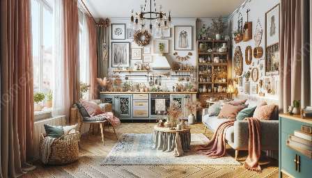
Inject a personal touch into your gallery wall by incorporating meaningful art pieces, photographs, or mementos. Adding elements that hold sentimental value will not only enrich the visual appeal but also infuse your space with personal stories and memories.
Texture and Dimension
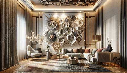
Consider adding texture and dimension to your gallery wall through the use of varied materials and artistic mediums. Mix framed artwork with three-dimensional elements, such as wall sculptures, woven tapestries, or decorative mirrors, to add depth and visual interest.
Dynamic Lighting
Optimize the visual impact of your gallery wall through strategic lighting. Experiment with different lighting fixtures, such as spotlights, wall sconces, or adjustable track lights, to highlight specific art pieces and create a captivating ambiance within the space.
Creating Focal Points
Introduce focal points within your gallery wall to draw attention and create visual anchors. Whether through a striking piece of art, an eye-catching arrangement, or a unique display technique, creating focal points can elevate the overall impact of your gallery wall.
Conclusion
Balancing colors and shapes in a gallery wall is a meticulous art that can significantly enhance the visual appeal of your decor. By understanding the role of colors and shapes, and leveraging these insights to arrange your gallery wall with balance and harmony, you can create a captivating display that reflects your unique style and aesthetic preferences. Pairing this knowledge with the art of decorating with appealing visual content allows you to transform your space into a dynamic and visually engaging environment.

