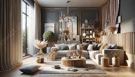
Color is a key element in design and interior decor. Understanding color proportions and ratios is essential for creating visually appealing spaces. In this comprehensive guide, we will explore how to effectively utilize color schemes and palettes to enhance homemaking and interior decor.
Understanding Color Proportions and Ratios
Color proportions and ratios play a crucial role in design. By understanding the fundamentals of color theory and how different colors interact with each other, designers can create harmonious and balanced compositions. A well-balanced color scheme can evoke specific emotions and set the tone for a space.
Color Theory
Color theory encompasses the study of how colors interact and the relationships between different hues. Understanding the color wheel and complementary, analogous, and triadic color schemes is essential for achieving visually pleasing proportions and ratios in design. By using these principles, designers can create cohesive color palettes that enhance the overall aesthetic of a space.
Color Psychology
Color psychology considers the impact of different colors on human emotions and behaviors. Certain colors are known to evoke specific feelings, such as calmness, energy, or warmth. By leveraging color psychology, designers can create environments that cater to the emotional needs of the inhabitants, making the space more comfortable and inviting.
Color Schemes and Palettes
Color schemes and palettes are foundational tools in design and interior decor. They provide a framework for selecting and combining colors to achieve a desired visual impact. The following are some common color schemes and palettes:
Monochromatic
A monochromatic color palette revolves around a single hue, varying its shades, tints, and tones. This creates a harmonious and calming effect, making it a popular choice for interior decor. By understanding the proportions of light and dark shades within the monochromatic scheme, designers can create depth and visual interest.
Analogous
Analogous color schemes consist of colors that are adjacent to each other on the color wheel. This creates a cohesive and harmonious palette that is visually appealing. Understanding the proportions and ratios of the analogous colors allows designers to create a balanced and unified look in a space.
Complementary
Complementary color schemes involve colors that are opposite each other on the color wheel. These contrasting colors create a dynamic and vibrant visual impact. By understanding the right proportions and ratios of complementary colors, designers can achieve a striking balance in their designs.
Homemaking & Interior Decor
Applying the principles of color proportions and ratios to homemaking and interior decor is crucial for creating inviting and visually pleasing spaces. Consider the following tips:
Balance and Harmony
Understanding the proper proportions and ratios of colors allows homemakers and designers to create balanced and harmonious spaces. By considering the distribution of colors and their visual impact, they can achieve a cohesive and aesthetically pleasing interior decor.
Emotional Impact
Utilizing color proportions and ratios effectively can evoke specific emotions and enhance the atmosphere of a space. Warm colors such as red and orange can create a cozy and inviting ambiance, while cool colors like blue and green can promote a sense of calmness and tranquility.
Focal Points and Accents
By understanding color proportions and ratios, homemakers can strategically use contrasting colors to create visual focal points and accents within a space. This can draw attention to specific areas or architectural features, adding visual interest and depth to the decor.


