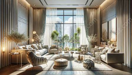
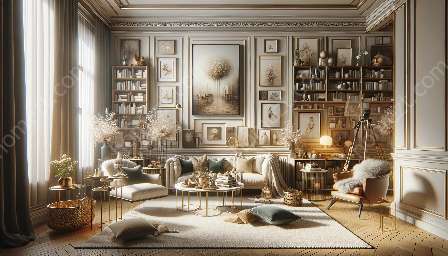
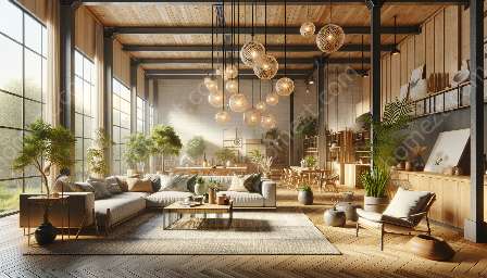
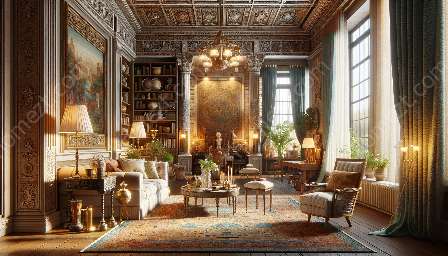
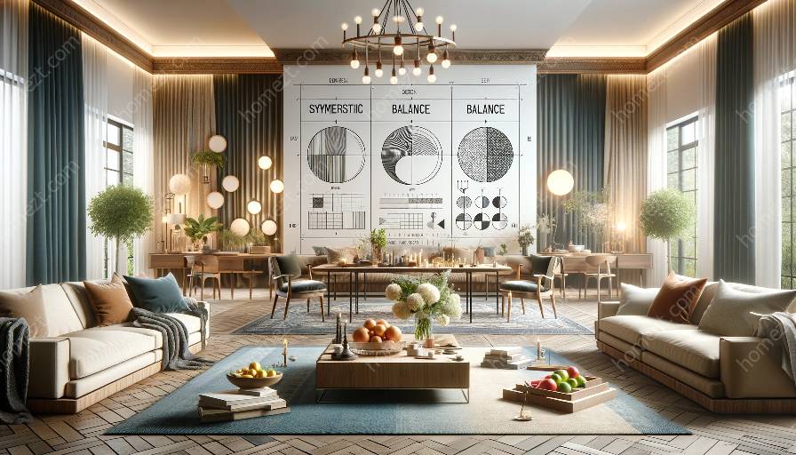
When it comes to interior design and styling, achieving visual balance is crucial for creating a harmonious and attractive space. However, there are common mistakes that can hinder the achievement of visual balance. To avoid these mistakes, it's essential to understand the principles of design and balance and how they apply to interior decor.
Principles of Design
Before delving into common mistakes, it's important to have a good grasp of the principles of design. These principles guide the arrangement, composition, and organization of elements in interior decor to create visually appealing spaces. The key principles of design include:
- Balance
- Proportion
- Emphasis
- Rhythm
- Unity
- Variety
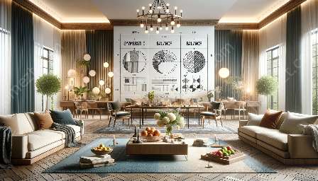
Among these principles, balance plays a significant role in achieving visual harmony within a space. There are different types of balance that can be applied, such as symmetrical balance, asymmetrical balance, and radial balance. Understanding these balance types is essential for avoiding common mistakes in achieving visual balance.
Common Mistakes in Achieving Visual Balance
1. Ignoring Symmetry and Asymmetry
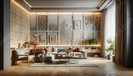
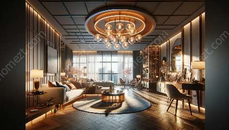
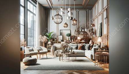
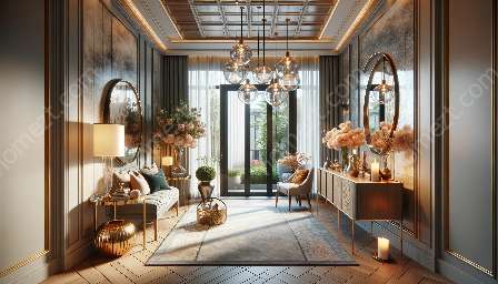
One of the most common mistakes in achieving visual balance is ignoring the principles of symmetry and asymmetry. Symmetrical balance involves arranging elements equally on both sides of a central axis, creating a sense of stability and formality. On the other hand, asymmetrical balance involves achieving equilibrium through the use of dissimilar objects with equal visual weight. Ignoring these balance principles can result in a lopsided or chaotic look within the interior decor.
2. Overlooking Proportion and Scale
Another mistake that affects visual balance is overlooking proportion and scale. Proportion refers to the comparative relationship between elements, while scale refers to their size in relation to the surrounding space. Using disproportionately sized or scaled elements can disrupt the visual equilibrium and make the space feel awkward or unbalanced.
3. Lack of Focal Point
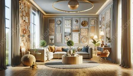
A focal point serves as a visual anchor within a space, drawing attention and creating a sense of balance. A common mistake is the lack of a clear focal point in interior decor, which can result in a scattered and uncoordinated appearance. Incorporating a focal point, such as a statement piece or a striking feature, can help in achieving visual balance.
4. Neglecting Texture and Pattern
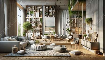
Texture and pattern add depth and visual interest to interior decor, but neglecting their role can lead to visual imbalance. Using too much or too little texture and pattern can disrupt the overall harmony of the space. Understanding how to balance different textures and patterns is crucial for achieving a cohesive and visually appealing environment.
5. Disregarding the Flow of Movement
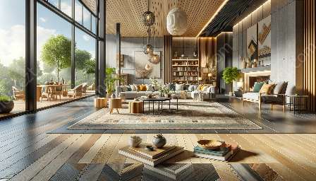
The flow of movement within a space contributes to its visual balance. Disregarding the flow can result in a disjointed and unsettling atmosphere. It's essential to consider how people move through and interact with the space to ensure a harmonious and balanced layout.
Applying Principles of Design and Balance
Now that the common mistakes in achieving visual balance are highlighted, it's important to explore how the principles of design and balance can be applied effectively in interior decor. By applying these principles, a harmonious and visually balanced space can be created.
- Balance: Consider the type of balance suitable for the space, whether it's symmetrical, asymmetrical, or radial. Distribute elements to create a sense of equilibrium and visual stability.
- Proportion: Maintain proper proportions of furnishings and decor elements to ensure a balanced relationship between them.
- Emphasis: Establish a focal point within the space, such as a striking artwork or a unique piece of furniture, to draw attention and create visual balance.
- Rhythm: Create a sense of rhythm by repeating elements, whether it's color, shape, or texture, to establish visual continuity and harmony.
- Unity: Ensure that the elements within the space work harmoniously together, creating a cohesive and unified look.
- Variety: Introduce variety in elements, such as textures, patterns, and colors, while maintaining a sense of equilibrium and cohesiveness.
Conclusion
Visual balance is an essential aspect of interior decor that contributes to the overall appeal and harmony of a space. By understanding the principles of design and balance, as well as being mindful of common mistakes, a visually balanced and attractive interior can be achieved. Avoiding mistakes such as ignoring symmetry and asymmetry, overlooking proportion and scale, neglecting texture and pattern, and disregarding the flow of movement, can lead to a more harmonious and visually appealing environment. By applying the principles of design and balance, creating a balanced and visually appealing space becomes a feasible and rewarding endeavor.

