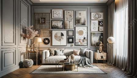
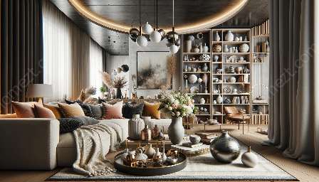
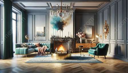
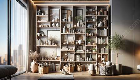
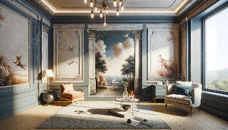
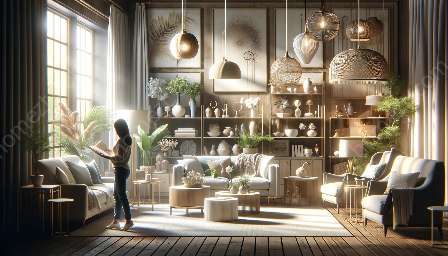
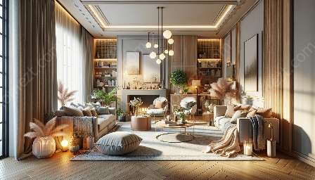
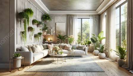
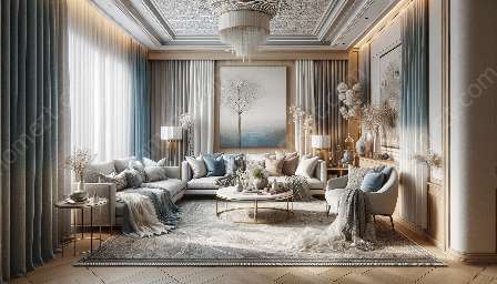
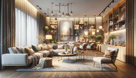
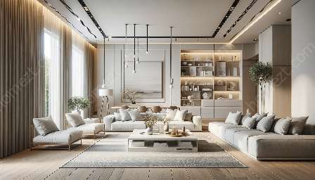
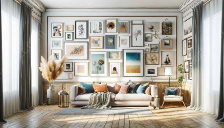
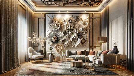
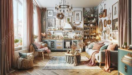
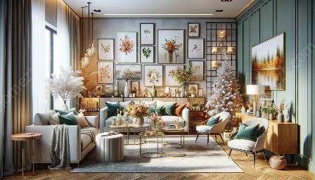
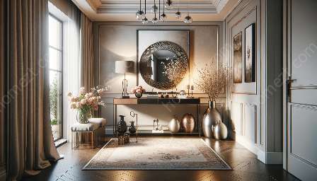
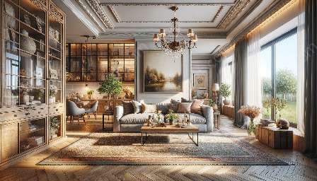
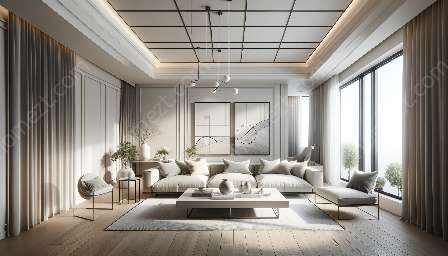
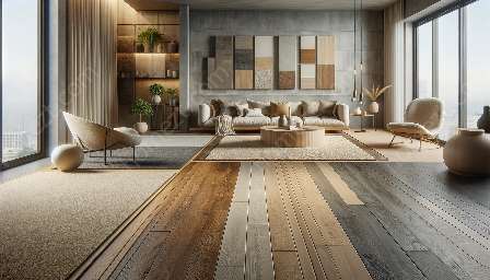
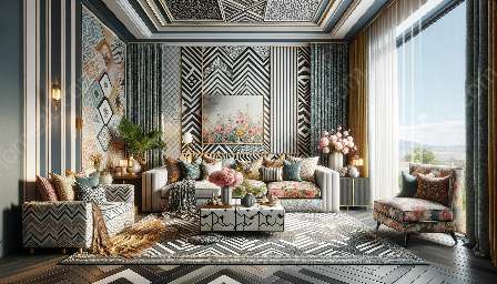
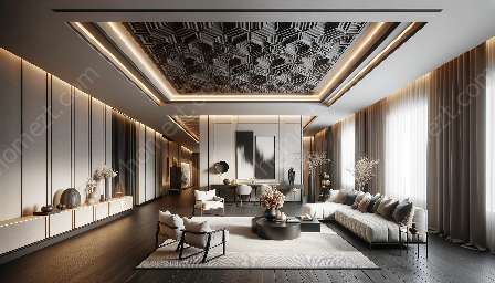
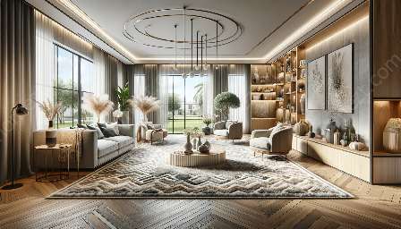
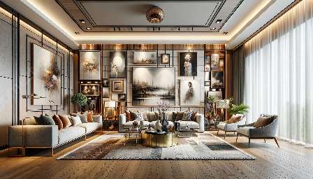
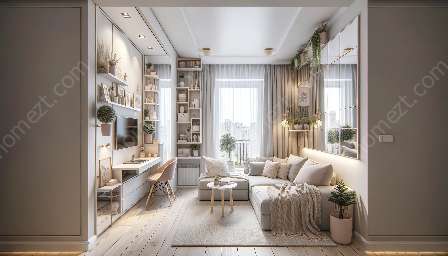
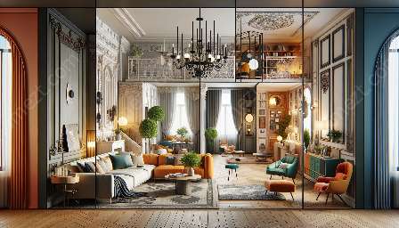
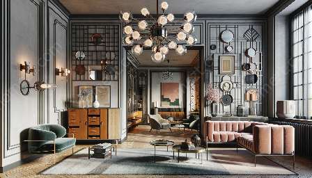
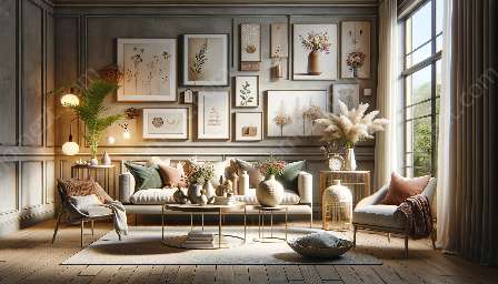
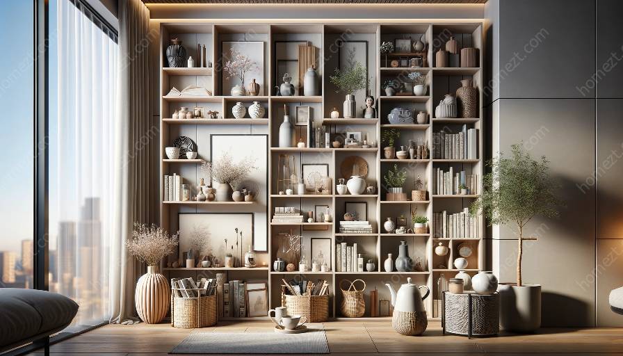
Shelf and display design is not just about arranging items, but also about creating a visually appealing and harmonious space. By understanding the principles of visual hierarchy and balance, you can elevate the aesthetics and functionality of your shelves and display areas, creating attractive and impactful decorations.
Visual Hierarchy in Shelf and Display Design
Visual hierarchy is the arrangement of design elements in a way that influences the order in which they are viewed. In shelf and display design, visual hierarchy plays a crucial role in guiding the eye to important elements and creating a sense of order and organization.
- Size and Scale: One way to establish visual hierarchy is by varying the size and scale of items on the shelves. Larger items naturally draw attention and can serve as focal points, while smaller items create visual interest and balance.
- Color and Contrast: Contrast in color and tone can be used to create visual hierarchy. Brightly colored or high-contrast items can stand out against a neutral background, drawing the eye and creating focal points.
- Position and Alignment: Placing items strategically can also establish visual hierarchy. Items placed at eye level or centered on a shelf are more likely to be noticed first, guiding the viewer's gaze to those areas.
- Typography and Signage: If the display includes text or signage, using typography effectively can create hierarchy. Bolder or larger text will naturally attract attention and can be used to highlight key information.
Balance in Shelf and Display Design
Balance is essential for creating a sense of visual stability and harmony in shelf and display design. A well-balanced arrangement ensures that no single area feels overwhelming or neglected, and that the overall composition feels cohesive and pleasing to the eye.
- Symmetrical Balance: This involves mirroring the arrangement of items on both sides of a central axis. It creates a sense of formality and order, well-suited for traditional and formal displays.
- Asymmetrical Balance: Asymmetrical balance is achieved by distributing visual weight unevenly. It can create dynamic and informal compositions, with a more relaxed and modern aesthetic.
- Radial Balance: In some cases, a radial arrangement around a central focal point can create balance. This approach is often used for circular displays or shelves with a central point of interest.
- Texture and Material: Balancing different textures and materials on the shelves can also create visual balance. Combining smooth and rough textures, or mixing different materials, can add depth and balance to the display.
Applying the Principles to Decorating
Understanding visual hierarchy and balance also plays a fundamental role in effective decorating. By applying these principles, you can create visually appealing and functional arrangements that enhance the overall aesthetic of your space.
- Focal Points: Using visual hierarchy, you can create focal points in your decor that draw the eye and serve as centerpieces for the room. Whether it's a striking piece of art or a carefully curated collection, establishing focal points can elevate the design impact of the space.
- Coordinated Arrangements: Applying principles of balance, such as symmetrical or asymmetrical balance, can help you create cohesive and visually pleasing arrangements within your decor. Whether it's arranging objects on a mantle or creating a vignette on a side table, achieving balance contributes to a harmonious design.
- Color Schemes: Understanding the role of color and contrast in visual hierarchy allows you to use color schemes effectively in decorating. By considering the visual weight of different colors and their interaction, you can create balanced and harmonious palettes for your shelves and display areas.
By understanding and applying the principles of visual hierarchy and balance in shelf and display design, you can create not only visually attractive arrangements but also functional and impactful decorations. With attention to size, scale, color, contrast, and balance, you can elevate the aesthetics of your shelves and displays, enhancing the overall ambiance of your space.

