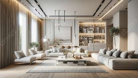
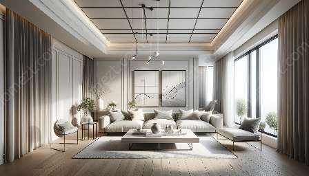
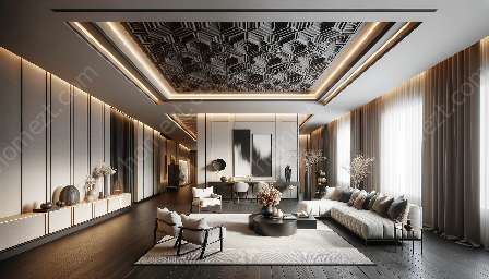
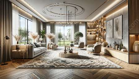
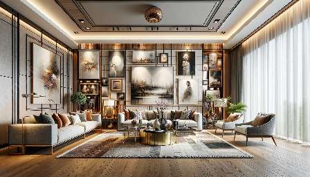
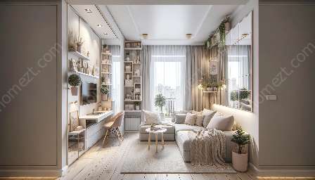
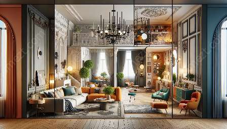
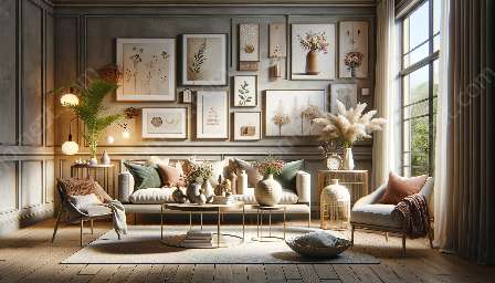
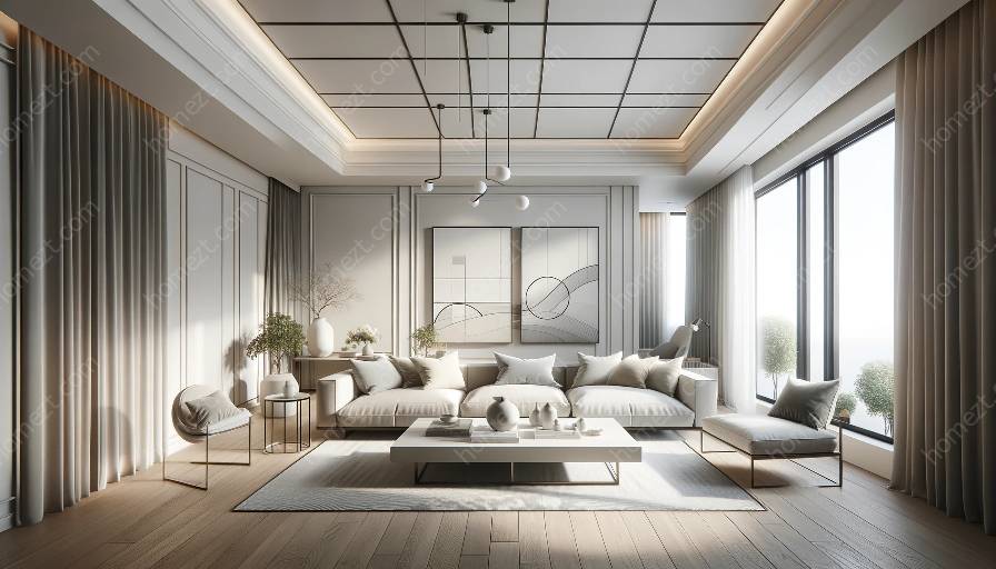
Minimalist design has gained popularity for its clean, simple aesthetic and focus on functionality. When implemented effectively, it can create a stylish and serene space. However, achieving a successful minimalist design requires careful consideration and avoidance of common mistakes. Whether you're creating a minimalist design from scratch or redecorating with a minimalist approach, it's important to be aware of potential pitfalls. In this article, we'll explore some common mistakes to avoid when implementing minimalist design and how it relates to creating a minimalist design and decorating.
1. Cluttering the Space
One of the fundamental principles of minimalist design is to reduce clutter and maintain a sense of openness. However, a common mistake is cluttering the space with unnecessary items. To avoid this, focus on simplicity and functionality. Start by decluttering the space and only keep essential items that serve a purpose. Opt for multi-functional furniture and storage solutions to minimize visual clutter while maximizing utility.
2. Overlooking Texture and Material
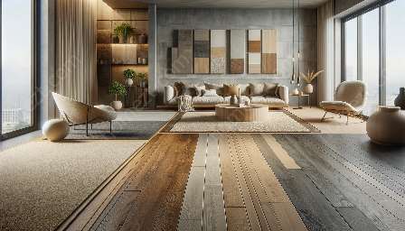
Minimalist design doesn't mean sacrificing texture and material variety. Overlooking the importance of texture and material selection can result in a flat and uninspiring space. It's essential to introduce tactile elements such as natural wood, soft fabrics, and tactile finishes to create visual interest and depth within a minimalist setting. Aim for a thoughtful mix of textures and materials to add warmth and character without compromising the minimalist aesthetic.
3. Neglecting Functionality
While focusing on aesthetics, it's crucial not to neglect functionality. A common mistake in minimalist design is prioritizing form over function. When creating a minimalist space, consider the practicality and usability of each element. Choose furniture and decor pieces that not only look good but also serve their intended purpose efficiently. Functionality should be at the forefront of your design decisions to ensure that the space remains both beautiful and practical.
4. Ignoring Proper Lighting
Lighting plays a significant role in minimalist design, yet it's often overlooked. Ignoring proper lighting can lead to a lackluster and uninviting atmosphere. Embrace natural light by minimizing window treatments and strategically placing mirrors to bounce light throughout the space. Additionally, incorporate ambient, task, and accent lighting to create a well-lit and inviting environment. Thoughtful lighting design can enhance the minimalist aesthetic while promoting a sense of openness and airiness.
5. Failing to Establish a Focal Point
Without a clear focal point, a minimalist space can appear bland and lacking in visual interest. Failing to establish a focal point is a common mistake that can hinder the overall impact of the design. Whether it's a striking piece of artwork, a sculptural furniture item, or an architectural feature, identifying and highlighting a focal point can bring depth and character to a minimalist space. By creating a central point of interest, you can elevate the design while maintaining a clean and uncluttered environment.
6. Compromising Comfort
Minimalist design should not sacrifice comfort for the sake of aesthetics. However, a prevalent mistake is compromising comfort in pursuit of minimalism. When implementing minimalist design, it's essential to prioritize comfort without undermining the clean and streamlined look. Select furniture with ergonomic design, incorporate soft textiles, and create cozy nooks to ensure that the space remains inviting and comfortable. Balancing comfort with minimalism is key to creating a harmonious and livable environment.
7. Neglecting Personal Touches
Amid the pursuit of minimalism, it's easy to neglect personal touches that add depth and personality to a space. Avoiding personal touches can result in a sterile and impersonal atmosphere. Incorporate meaningful objects, artwork, or mementos that resonate with you to infuse the space with a sense of identity and intimacy. These personal touches can humanize the minimalist environment and make it more inviting and reflective of your personality.
8. Disregarding Scale and Proportion
Scale and proportion are critical considerations in minimalist design. Disregarding these principles can lead to an imbalance in the space. When selecting furniture and decor, pay attention to scale and proportion to ensure that each piece harmonizes with the overall composition. Avoid undersized or oversized elements that disrupt the visual equilibrium of the space. By maintaining a sense of balance and proportion, you can achieve a cohesive and visually pleasing minimalist design.
Conclusion
As you embark on the journey of implementing minimalist design, be mindful of these common mistakes to steer clear of design pitfalls and create an attractive and functional minimalist space. By avoiding the pitfalls of clutter, overlooking texture, neglecting functionality, ignoring lighting, failing to establish a focal point, compromising comfort, neglecting personal touches, and disregarding scale and proportion, you can achieve a successful minimalist design that exudes simplicity, elegance, and purposeful design.

