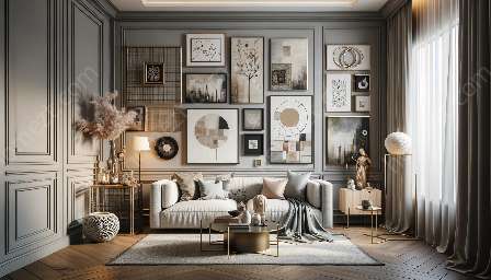
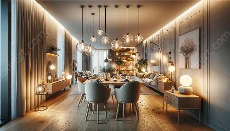
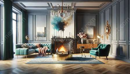
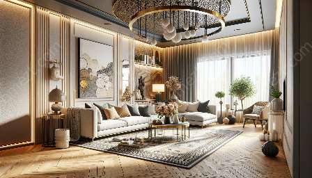
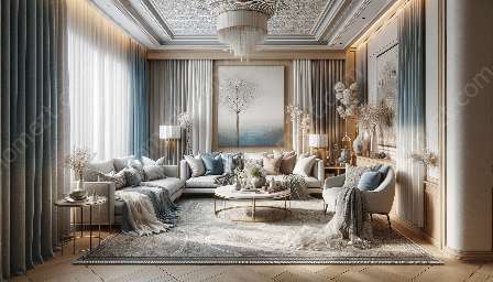
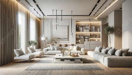
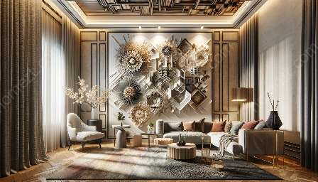
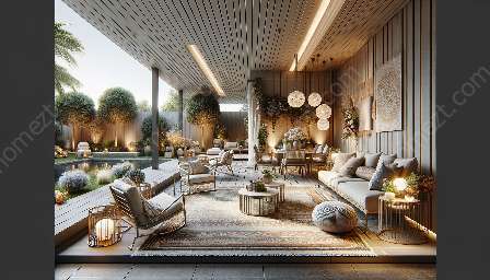
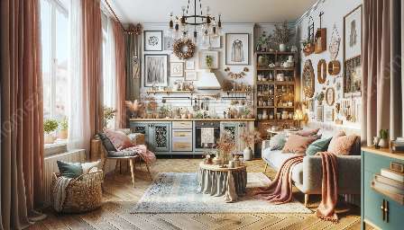
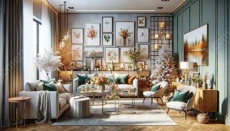
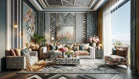
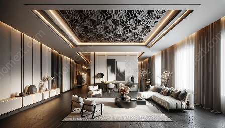
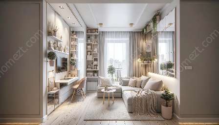
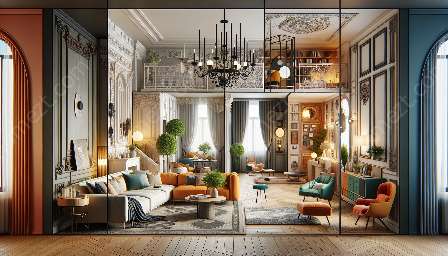
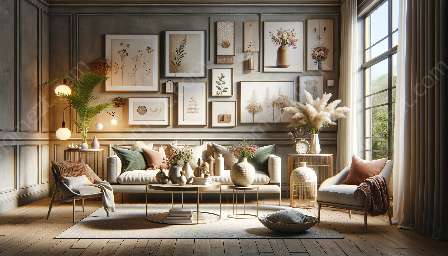
Color theory plays a crucial role in creating cohesive and attractive designs. It influences the way colors interact, evoke emotions, and define the aesthetic of a space. When applied effectively, color theory can lead to visually harmonious and balanced decorating schemes that appeal to the senses and elevate the overall experience of a room.
The Fundamentals of Color Theory
Understanding the fundamentals of color theory is essential for creating cohesive designs. The three primary components of color theory are hue, saturation, and brightness. Hue refers to the pure spectrum colors, saturation defines the intensity and purity of a color, and brightness determines the lightness or darkness of a color.
Colors are categorized into different schemes based on their relationships with each other. Monochromatic schemes use variations of a single color, analogous schemes involve colors adjacent to each other on the color wheel, and complementary schemes combine colors that are opposite each other on the color wheel. Additionally, triadic and tetradic schemes utilize three or four colors in equal distances on the color wheel, creating vibrant and dynamic palettes.
These color schemes form the backbone of cohesive design, providing a framework for creating balanced and visually appealing spaces. By understanding the interplay of colors, decorators and designers can effectively manipulate the visual impact of a room.
Color Psychology and Its Impact on Design
Color psychology delves into the emotional and psychological effects that different colors have on individuals. Each color carries its own associations and symbolism, influencing mood, energy levels, and perceptions. For instance, warm colors like red, orange, and yellow can evoke feelings of warmth, energy, and excitement, while cool colors such as blue, green, and purple are often associated with tranquility, calmness, and harmony.
When designing a space, understanding color psychology can guide the selection of hues to evoke specific moods and emotions. By aligning the chosen colors with the desired ambiance and purpose of the room, designers can create cohesive and emotionally resonant interiors that connect with occupants on a deeper level.
Practical Tips for Implementing Color Theory in Cohesive Design
Implementing color theory in decorating and design involves a few key strategies. First, establishing a focal point through color can draw attention and create visual interest, anchoring the design scheme. Additionally, using a variety of shades and tones within a color scheme can add depth and dimension, preventing a space from appearing visually flat.
Moreover, understanding the concept of color temperature is crucial for cohesive design. Warm and cool colors can be strategically balanced to create a harmonious atmosphere within a room. Layering neutrals with pops of color can also add sophistication and visual balance to a space.
Considering the natural light and its effects on color is equally important. Natural lighting can alter the perception of color, influencing the overall look and feel of a room. By accounting for natural light, decorators can ensure that the chosen colors are showcased in their truest form.
Conclusion
Color theory is an indispensable tool for creating cohesive and attractive designs. It underpins the selection, combination, and application of colors in decorating and design, guiding the creation of visually balanced and emotionally resonant spaces. By leveraging the principles of color theory, designers and decorators can craft harmonious interiors that captivate the senses and bring aesthetic delight to inhabitants.

